

Benchmarking a wellness program means comparing your participation, engagement, absence and cost metrics against published external benchmarks and against your own pre-program baseline, using definitions and measurement periods that match on both sides of the comparison. You pick a small metric set, freeze a definition and a period for each one, establish roughly 12 months of pre-program data, then read the gap as a diagnostic signal rather than a pass/fail score. Set aside about four to six weeks the first time through; most of that is agreeing on definitions, not crunching numbers.
One number will not carry it. A participation rate tells you whether people showed up, not whether anything got better, and an employer can push it higher without the workplace changing at all. What follows is the process I would hand to a benefits lead in their first month, with the awkward parts left in.
Table of Contents
- What You Need
- Step-by-Step: How to Benchmark Your Wellness Program
- Common Mistakes
- Frequently Asked Questions
- What are the key metrics used to measure employee wellness program effectiveness?
- What is a good wellness program participation rate?
- How do I calculate wellness program ROI?
- How often should I benchmark a wellness program?
- How much do companies pay for wellness programs?
- Why do some wellness programs fail to show measurable results?
- Conclusion
What You Need

You need six things settled before any comparison happens, and none of them are software.
- Program scope. What is actually in the program: the employee assistance program, onsite clinical services, fitness reimbursement, mental health support, manager training. Benchmarks for one of these do not transfer to another.
- Employee population. The denominator, defined the same way every time. Headcount, eligible employees or covered lives are three different denominators, and mixing them produces a number that looks fine and means nothing.
- Objectives. What the program is meant to move. Reach, engagement, health outcomes and financial return are different goals and need different measures.
- Measurement period. Calendar year, fiscal year or a rolling 12 months. Pick one and never change it mid-series without restarting the series.
- Baseline data. Roughly 12 months of pre-program history for every metric you intend to report.
- Named benchmark sources. Where the comparison ranges come from, with the publication and year recorded next to each figure.
If you are an employer under about 500 people, add one more item: a minimum cohort size for subgroup reporting. Below roughly 10 people in a location, shift or job family, results move too much on noise to mean anything, and in a small company the risk of identifying an individual through a subgroup number is real.
Step-by-Step: How to Benchmark Your Wellness Program
Set the purpose and scope
Start by writing the decision the benchmark has to support. Renewal at contract term, a budget cut, a redesign after low uptake, or a leadership readout are four different decisions, and each one wants different numbers. Knowing which decision you are preparing for stops you from collecting twelve metrics you will never use.
Next, separate organizational performance from individual health outcomes. Your program might reach 11 percent of employees while the health of the population moves not at all; that is a program performance result, not a health result, and presenting it as one will not survive a finance review.
Choose meaningful measures before you benchmark your wellness program
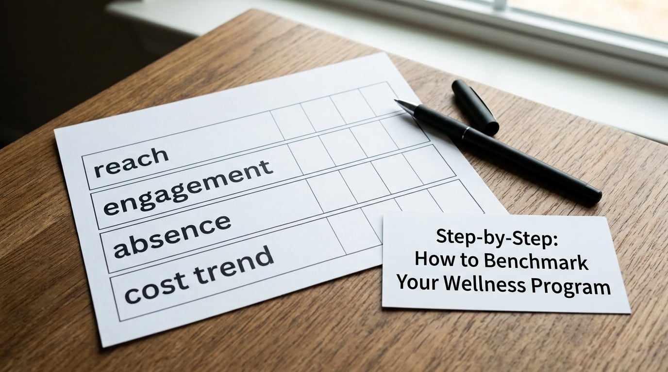
A workable set covers five areas and stops there. Reach, participation and utilization tell you whether anyone is using it. Engagement depth tells you whether one session or a sustained relationship. Access and equity tell you who is not being reached. Operational and cost measures tell you whether the money moved. A short sentiment survey handles much of the first two.
Pair each leading indicator with something operational behind it. Participation alone is weak; participation plus continuation plus time-to-first-support tells you whether the program is used once out of curiosity or repeatedly by someone getting better. Vendor guidance on EAP measurement makes the same point, framing utilization as a design signal rather than a score.
Collect reliable baseline data
Your baseline is the twelve months before launch, pulled from sources that already exist: the HRIS for headcount and absence, the benefits system for covered lives and cost trend, the vendor for utilization detail, and a short annual survey for sentiment. You are assembling four data sources and reconciling them, not commissioning research.
Write down three things for every metric in a data dictionary: the definition, the denominator, and the measurement period. Missing data is common, especially before a program exists, so record what you could not get rather than leaving a gap that someone later fills with an estimate.
Privacy rules belong in this step, not the reporting step. Set a minimum cohort size for any subgroup you publish, agree with the vendor in writing that individual-level usage data stays confidential and is never reported back to managers, and write your employee communications so they describe aggregate reporting rather than promising absolute privacy you cannot deliver.
Calculate comparable results
Keep the arithmetic boring and the denominators explicit. Utilization rate is unique users divided by eligible employees, multiplied by 100. At 10,000 eligible employees with 800 unique users over a rolling 12 months, that is 8 percent. The same organization could easily produce a 30 percent number by counting visits, or a 40 percent number by counting completed sessions instead of logins; both are true descriptions of different things and neither is comparable to the first.
Also calculate the mean rather than leaning on a single year-end snapshot, the year-over-year change for every metric, and the gap between your best and worst performing subgroup. Costs are usually reported as per-member-per-month and adjusted for risk so a sicker population does not look like a failed program.
Compare against credible references
Four kinds of comparison carry real weight, and they answer different questions. Your own trend line answers whether things are moving. Peer organizations of similar industry, size and geography answer whether your level is unusual. Recognized public-health and professional-body references answer whether the target itself is sensible. Published practice standards answer whether the program design is defensible.
The organizations that publish usable ranges include the National Business Group on Health, EAPA, SHRM, Mercer, and CDC or NIOSH for absence and safety measures. Treat each figure as a starting point with a methodology attached. Survey-based benchmarks usually come from large employers, which skew toward bigger firms with dedicated benefits staff, so read the sample description before you adopt a number.
Interpret results and set targets
Read participation bands as diagnostics. Under 5 percent usually points to awareness or access failure: employees do not know the program exists, or the route to it is hard. Between 5 and 10 percent is a normal range for a new voluntary program. Between 10 and 15 percent suggests good reach with room to deepen engagement. Above 15 percent, ask what is driving it, because promotional campaigns and auto-enrollment can lift the number without changing behaviour.
Then set targets against your own baseline rather than against the highest band in a survey. Document the limitations before you present: sample size, seasonality in absence data, self-report versus claims data, and any program change that landed mid-period. Leadership trusts a readout that names its weaknesses more than one that claims everything moved in the right direction.
Set a reporting cadence and an owner
Benchmarks go stale fast. Utilization and sentiment quarterly, absence and cost trend monthly, turnover and retention twice a year, and a full written benchmark review annually before contract renewal. Assign each metric to a named person, usually benefits for utilization and cost, HR analytics for absence and turnover, and the vendor for clinical and engagement detail. A metric with no owner decays within two quarters.
Common Mistakes
Eight errors account for most bad wellness benchmarks.
- Comparing unlike populations. A participation rate from a 5,000-employee national employer is not a fair yardstick for a 200-person regional firm. Match by industry, size, geography and workforce profile.
- Using participation as the only measure. It is the easiest number to move and the easiest to move artificially. Pair it with depth, absence and cost.
- Ignoring equity. A healthy average can hide a location, shift or job family that is being left out. Always break participation down by the subgroups you are allowed to report.
- Changing definitions midstream. If “user” stops meaning “unique person with a completed session” in year two, the series is broken. Restart it instead of splicing it.
- Mixing measurement periods. A rolling 12-month rate next to a calendar-year rate will mislead you even when both are computed correctly.
- Reporting small cohorts. Under roughly 10 people in a subgroup, a swing of one or two cases reorders every rate you publish. Suppress or merge.
- Treating correlation as proof. Absence may fall the same year you launched a program and have nothing to do with it. Look for comparison groups or trend lines before you attribute movement to the program.
- Benchmarking once and forgetting. A single annual number cannot show you whether a change worked. Quarterly snapshots cost less than one bad renewal.
If you have no analytics team, a spreadsheet is enough: one tab per metric, one row per quarter, definitions frozen in a header row, and a comparison tab pulling the external range in beside your number. The method matters more than the tool.
Frequently Asked Questions
What are the key metrics used to measure employee wellness program effectiveness?
Seven metrics cover most programs: utilization or participation rate, engagement depth such as visits per participant, time-to-first-contact, absenteeism, healthcare cost trend, turnover or retention, and a financial measure combining return on investment with value on investment. ROI covers financial benefit such as avoided absence cost; VOI covers outcomes that are real but hard to price, like satisfaction and perceived support. Use both, and keep definitions fixed year over year.
What is a good wellness program participation rate?
For a voluntary employee assistance or wellness program, most published reference ranges sit in the mid single digits, with rates of roughly 10 percent or more generally read as strong reach. Treat bands as diagnostics rather than scores: under 5 percent usually signals an awareness or access problem, not a disinterest problem. Definitions differ widely, so confirm whether the vendor counts logins, unique users or completed sessions before comparing.
How do I calculate wellness program ROI?
ROI is (measured benefit minus program cost) divided by program cost, expressed as a ratio. Measured benefit usually comes from changes in absence days, healthcare cost trend or turnover attributable to the program. Build ROI on a pre-program baseline and a comparison group where you can, because attributing every movement to the program is the most common reason finance teams reject wellness numbers.
How often should I benchmark a wellness program?
Report utilization and sentiment quarterly, absence and cost trend monthly, and turnover twice a year, then write a full benchmark review annually before any contract renewal. Quarterly is the practical floor: annual snapshots miss the effect of a campaign or a seasonal spike, and monthly reporting of everything produces noise nobody reads.
How much do companies pay for wellness programs?
Costs vary by program type, workforce size and benefit design, so any figure you find is only meaningful with its year and its denominator. Rather than quoting a single number, build a per-employee-per-month cost from your own invoices and compare it against benefits benchmarking publications such as Mercer, SHRM or National Business Group on Health surveys, then note the year of each source you use.
Why do some wellness programs fail to show measurable results?
Usually the cause is measurement design rather than program design. Participation gets reported without a baseline, definitions change between years, absence data is compared without adjusting for season, and subgroups too small to support a number are reported anyway. Another common cause is credibility: employees who believe their usage is visible to a manager will not use a confidential service.
Conclusion
To benchmark your wellness program, document what the program actually is, freeze a small set of measures with written definitions and one measurement period, and build twelve months of baseline from data you already have. Only then pull external ranges, compare like with like, and read the gap as a diagnosis. Start there this quarter and the numbers will be arguable in a good way rather than decorative.